
A FocusLens Report Walkthrough: 6h 11m Focused, Here's the Proof
A screen-by-screen walkthrough of a real FocusLens daily report — goal, focus rate, time allocation table, and the per-entry reasons that make the numbers believable.
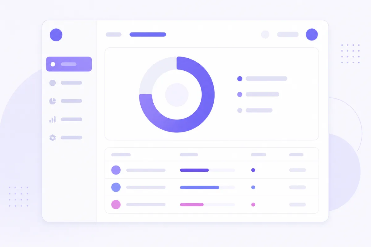
The fastest way to understand FocusLens isn't a feature list — it's one finished report. This walkthrough uses a real daily report shape — goal, focus rate, time-allocation table with reasons — and walks through what each part is for, what a client actually sees when they open it, and why the numbers aren't just AI vibes with a nice layout wrapped around them.
The header: goal, date range, focus rate
At the top of every report sits the part that gives everything below it meaning: the stated goal for the period, the date range it covers, and the resulting focus rate — in this example, 6h 11m out of an 8-hour day, a 77% focus rate. It's worth being precise about what "focused time" means here, because it's easy to misread. It's not total screen time, and it's not "time spent at the computer." It's goal-relevant minutes specifically — the subset of the day that the AI classified as advancing the stated goal, after comparing each capture against it. A long day with a lot of screen time and a mediocre focus rate is a completely normal, honest outcome; the number isn't designed to always look flattering, it's designed to be accurate.
The AI narrative summary
Just below the header sits a short, AI-written paragraph summarizing the day — a sentence or two on what the bulk of the focused time went toward, phrased in plain language rather than as a list. It deliberately leaves out the unfocused noise; the summary isn't trying to account for every minute of the day, only to describe the work that mattered. And it stays anchored to the table underneath it — every claim in the summary should be traceable to a row a reader can go check for themselves, which is what keeps it from drifting into generic flattery about how productive the day was.
The time-allocation table
This is the centerpiece of the report: a row per activity, with four columns — activity, minutes, share of the day, and the reason it was classified that way. The important detail is where the minutes and share numbers come from: they're computed directly from the underlying capture logs, arithmetic on timestamps, not something the language model invented or estimated. The model's only job is the reason column. Everything else in the table is deterministic math that a reader could, in principle, redo themselves from the raw logs and get the identical number.
Zooming in on one ambiguous row
Every report has at least one row that looks suspicious at first glance, and that's usually the most useful row to look at closely. In this example, one entry reads: "Market Dashboard — 14 min — 3% — Checked live pricing data to verify the stock-tracking app's feed matches real market values." Read the activity name alone and it looks exactly like someone checking their portfolio on the clock. Read the reason next to it, and the ambiguity disappears — it's directly tied to the stated goal, not a tangent from it. That's the row that demonstrates the whole point of the format: the reason column is doing real work, not decorative work. (This exact example gets the full explanation in the relevance scoring piece, if you want the mechanism behind it.)
 The reason column is what turns a suspicious-looking row into a settled one.
What is deliberately not in the report
No screenshots. No desktop footage. No raw OCR text dump. Only the structured summary a person chose to generate and, separately, chose to share. That's a deliberate design decision, not a limitation — the report is built to answer the question a client actually has ("what did the hours produce, and why should I believe it") without requiring anyone to hand over a recording of their entire desktop to answer it.
PDF vs. verified link, at the end of the walkthrough
Once a report like this exists, there are two ways to hand it off. Export it as a PDF when it needs to sit inside a paper trail that expects a file — attached to an invoice, filed alongside a contract. Publish it as a verified public link when it's part of an ongoing client relationship and you want something that stays live and checkable without regenerating a file each time. Either way, once it's published or exported, that specific snapshot stays frozen — the underlying local log can keep changing day to day, but the report someone already received doesn't quietly change out from under them. The verified public link explainer covers exactly what "frozen" means in that context.
How to generate your own
The steps are short: set a focus goal describing what you're actually working on, let capture run in the background while you work, then open Reports and either export a PDF or publish a link for the period you want to share. No extra tagging, no end-of-day journaling — the report assembles itself from what already got captured and classified while you worked.
The point of reading a walkthrough instead of a feature list
A report like this is what you hand a client instead of a spreadsheet apology. If what you just read matches the kind of work you already do — goal-scoped, defensible, explainable in a sentence per entry — the next step isn't reading another explainer. It's generating one from your own Mac and seeing what your own day actually looks like written up this way.
Generate your own report
Download FocusLens for Mac and generate your first report today. See more real examples in the report section on the homepage, or read the report trust FAQ if you've got a specific objection this walkthrough didn't cover.
Ready to see it in your own work?
Download FocusLens and generate your first focus report.